

Did you know that over 60% of global web traffic now comes from mobile devices? If your website design isn’t optimized for smartphones and tablets, you’re effectively blocking out more than half of your potential audience. With Google’s mobile-first indexing as the new standard, mobile-friendly web design is no longer optional—it’s the gateway to better rankings, more traffic, and happier users. This guide will walk you through everything you need to transform your strategy and thrive in a mobile-dominated world.
Mobile-Friendly Web Design: The Transformation Imperative
- Startling Statistic: Over 60% of global web traffic originates from mobile devices—ignoring mobile-friendly web design can mean losing more than half your potential audience.
- Unconventional Fact: Google’s mobile-first indexing affects every mobile website, making mobile web performance a critical ranking factor.
In today’s digital era, the necessity for mobile-friendly web design cannot be overstated. As the majority of online traffic now comes from mobile devices, building a friendly web experience that adapts seamlessly to any screen size is crucial for both user satisfaction and search engine optimization. Google’s move to mobile-first indexing means it uses your site’s mobile version as the primary basis for ranking and crawling in search results. If your web design isn’t putting mobile first, your organic reach and engagement are likely suffering. Mobile users have higher expectations for speed, accessibility, and navigation—delivering anything less can lead to rapid bounce rates and missed business opportunities.
For modern brands and organizations, mobile optimization is no longer a trend but a foundational best practice in website design. Beyond rankings, a mobile website that loads quickly, is easy to use on any device, and offers engaging content directly impacts your reputation and revenue. The imperative is clear: adaption isn’t just beneficial—it’s a matter of digital survival and growth.

What You'll Learn about Mobile-Friendly Web Design
- Definition and core principles of mobile-friendly web design
- Differences between responsive web design and other mobile site approaches
- Key elements and best practices for mobile website design
- Tools and techniques for optimizing mobile website experience
- How mobile web design impacts traffic, SEO rankings, and user engagement
Understanding Mobile-Friendly Web Design
What is Mobile-Friendly Web Design?
- Exploring mobile web, responsive web design, adaptive layouts, and mobile website vs. desktop site
Mobile-friendly web design is the practice of creating websites that function seamlessly on smartphones, tablets, and other mobile devices. This involves using responsive web design principles, which enable your web page layout to automatically adjust to different screen sizes. Whether a visitor arrives on a phone or a desktop site, the site adapts to deliver a consistent, intuitive experience.
There are a few core approaches to mobile web design: responsive web design (fluid grids and flexible images that scale with the device), adaptive layouts (multiple fixed layouts depending on device type), and dedicated mobile website versions (separate sites designed exclusively for mobile). The best approach depends on your goals, technical resources, and the nature of your content. Ultimately, a mobile-friendly site ensures every user receives a site tailored to their device—important for engagement, conversions, and overall user experience.

As you explore the nuances of mobile optimization, it's helpful to see how these strategies play out in real-world business scenarios. For a closer look at how mobile-friendly design trends are shaping the competitive landscape, check out the latest insights on current business headlines impacting small businesses.
Why is Mobile-Friendly Web Design Critical in Modern Web Design?
- Impact of mobile devices, mobile web usage trends, Google algorithms, and user experience on mobile sites
With the explosion of mobile devices in daily life, more users now access the internet on their phones than on laptops or desktops. This shift in behavior has made mobile web optimization mission-critical for any web designer or business owner. Google's algorithms now assess the mobile version of a site first when determining rankings, so a slow or poorly formatted site can hinder your visibility.
Additionally, users expect immediate, frictionless experiences on their mobile sites. Slow load times, awkward navigation, or inaccessible content lead to abandonment—and negative reviews. By investing in mobile-friendly web design, you create a digital environment where every visitor, regardless of device, enjoys an efficient, engaging journey. In a competitive digital market, this is not just a nicety, but a necessity to maintain and grow your presence.
Comparing Mobile-Friendly Web Design Approaches
Responsive Web Design vs. Adaptive Friendly Website Approaches
- Key differences, pros and cons, impact on web page performance and load times
When developing a mobile-friendly website, two terms often surface: responsive web design and adaptive design. Responsive web design relies on flexible grids and scalable images, creating a single site layout that automatically adapts to any device's screen size. This approach is generally easier to maintain since changes are universal across devices, but it can sometimes lead to longer load times on mobile if not properly optimized.
In contrast, adaptive web design provides multiple fixed layouts tailored for specific devices or screen widths, loading the most appropriate version for each visitor. While adaptive can offer more precision in user experience, it typically requires more development time and can be harder to maintain. Ultimately, responsive is typically favored for its practicality and future-proofing, though larger brands with specific requirements might opt for adaptive solutions.

Mobile Website Design vs. Mobile App: Which Should You Choose?
- User experience, mobile device compatibility, development cost and scalability
Choosing between a mobile website and a mobile app involves evaluating your business needs, user expectations, and technical resources. A mobile-friendly website is accessible from any browser and device, making it broadly compatible, cost-effective, and easy to update. It's perfect for reaching new customers, communicating information, and maximizing visibility with search engines.
Meanwhile, a mobile app can deliver richer, more personalized user experiences, but it's often more expensive to develop and maintain. Apps may also require repeated updates for different platforms (iOS, Android). For most organizations, a robust, responsive web design covers all essential use cases, with investment in a mobile app reserved for specific functionality or deep user interaction needs.
Mobile Version, Mobile Web, and Canonical Website Design: Best Practices
- SEO implications, content parity, mobile site navigation, and mobile web speed
SEO best practices dictate that your mobile version must closely mirror your desktop site in both content and functionality. Content parity ensures that search engines see—and can rank—your mobile-friendly site effectively. Consistency in navigation, internal linking, and metadata is critical. Avoid hiding major features or content from mobile users.
Speed is a crucial factor in mobile web design, affecting rankings and engagement alike. Simplifying navigation (e. g. , with collapsible menus), focusing on fast load times, and keeping user pathways short make it easy for visitors to find what they need. Always label the canonical version of your site to avoid duplicate content issues and maximize SEO value.
Key Elements of Mobile-Friendly Web Design
Optimizing Load Time for Mobile Web
- Image optimization, minimizing code, leveraging CDN, mobile website testing tools
Speed is the backbone of any successful mobile website design. Modern users expect blazing-fast access on their mobile devices; delays of even a few seconds can halve your engagement. Compressing images, leveraging next-gen formats (like WebP), and minimizing code bloat are non-negotiable techniques. Use a content delivery network (CDN) to speed up asset delivery for users worldwide.
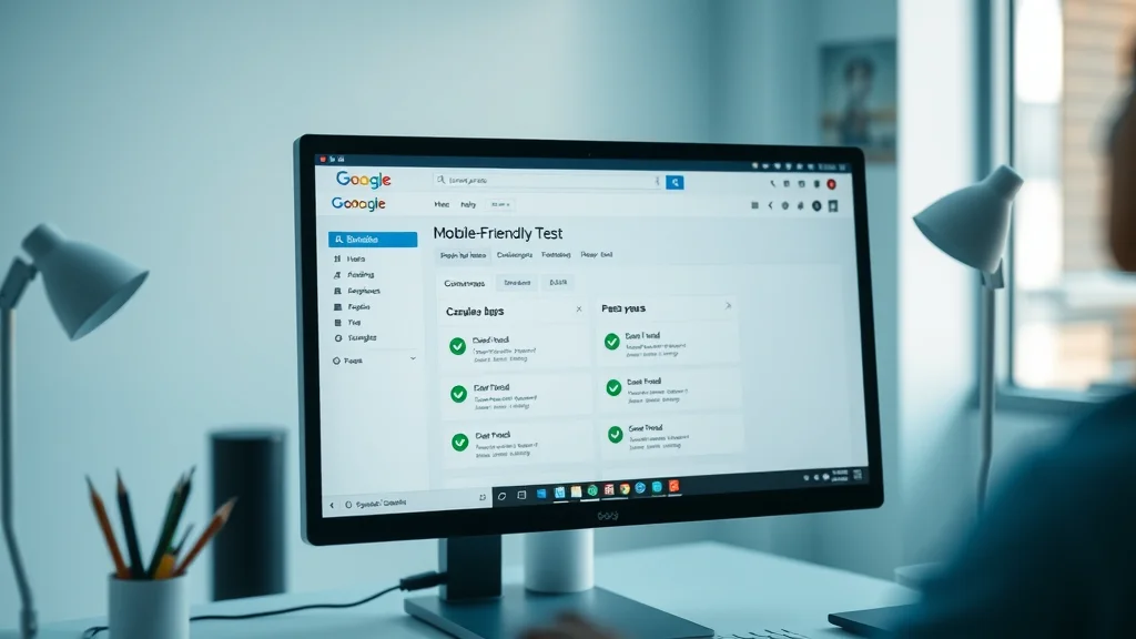
Take advantage of leading-edge tools such as Google’s Mobile-Friendly Test and Lighthouse to continually monitor your site’s speed and usability. Regularly analyze your web page with site speed analyzers and act on their recommendations. Prioritizing load time not only improves user experience but directly impacts your site’s SEO performance.

Designing for Small Screens: Responsive Web Layout and Navigation
- Touch targets, readable text, collapsible menus, friendly web visuals
Building for mobile means embracing the realities of smaller screens. Layouts must be flexible, with buttons and navigation elements large enough for easy tapping, and menus that collapse or expand smoothly. Prioritize readable fonts and clear visuals to ensure nothing gets lost on a small screen. Avoid clutter and allow for plenty of whitespace to create a friendly web environment that invites engagement.
Explore drop-down and hamburger menus to optimize navigation without overwhelming the viewport. Design all interactive elements with mobile users in mind, and test on multiple screen sizes to confirm usability and aesthetics remain intact. This kind of responsive web design advances both usability and professionalism.

Friendly Website Accessibility: Making It Easy for All Users
- Contrast ratios, screen readers, mobile devices accessibility features
True mobile-friendly web design ensures inclusivity. Use strong contrast ratios (minimum 4. 5:1 for text), enable compatibility with screen readers, and support device accessibility features. These choices not only help users with disabilities but also create a friendly website accessible to anyone, in any condition or environment.
Simple steps can make a massive impact—label all forms, use alt text for images, ensure keyboard navigability, and keep touch interactions predictable and forgiving. When you make it easy for users, you not only comply with global web standards but also establish trust and loyalty among your audience.

Integrating Social Media and Mobile Interactions
- Social media buttons, sharing integration, mobile site social engagement
Social media is integral to maximizing reach and virality. Place share buttons and interactive elements strategically within your mobile website content—making it effortless for users to amplify your content across their favorite networks. Ensure these buttons are touch-friendly, sized appropriately, and do not crowd valuable screen real estate.
Embedding seamless social media interactions increases user engagement and brand awareness. Use share popups, floating action buttons, or sticky social bars, all optimized for mobile design. Track analytics to see which platforms and sharing features perform best for your users, informing future improvements.

Comparison Table: Responsive Web Design vs. Adaptive Design vs. Separate Mobile Website
| Approach | Description | Maintenance | Performance | SEO Friendliness |
|---|---|---|---|---|
| Responsive Web Design | Single flexible layout adapts to all devices using CSS media queries | Easy – one site to manage | Can be highly optimized; initial load may include unnecessary assets | Excellent – single URL, content parity |
| Adaptive Design | Multiple fixed layouts for different device types, served dynamically | Moderate – multiple layouts to update | Very fast when optimized per device | Very good, but complexity can lead to errors |
| Separate Mobile Website | Distinct site (often m.domain.com) for mobile devices only | Complex – separate sites to maintain | Fast if optimized, but risks content drift | Requires careful canonical tagging for SEO |
Tools and Best Practices for Effective Mobile-Friendly Web Design
Essential Tools for Mobile Website Design
- Google Mobile-Friendly Test, Lighthouse, site speed analyzers, responsive web design frameworks
To build and maintain a high-performing mobile-friendly web design, certain tools are indispensable. Google’s Mobile-Friendly Test provides actionable insights on usability, while Lighthouse audits site speed, accessibility, and best practices. For coding and development, frameworks like Bootstrap or Foundation streamline responsive web design, making the process more efficient. Site speed analyzers such as GTmetrix or WebPageTest help you pinpoint bottlenecks and optimize assets for faster load times.
Investing in the right tools empowers web designers to identify issues before they impact users, measure progress, and maintain a smooth mobile web experience. Thorough testing across various devices, operating systems, and browsers is crucial to ensure that every web page not only looks great, but delivers on performance.
List: Top 10 Mobile Web Design Best Practices
- Use fluid grids for flexible layouts on all screen sizes
- Implement scalable images to ensure sharp visuals on any device
- Prioritize touch-friendly buttons and navigation
- Test on multiple real devices and browsers
- Compress images and code for faster load times
- Design with high-contrast, readable fonts and colors
- Minimize pop-ups and intrusive ads
- Simplify forms for quick, painless input on small screens
- Provide clear, easy-to-find calls-to-action
- Continuously monitor, test, and refine based on analytics and user feedback

"A mobile-friendly web design is no longer optional. It is the cornerstone of modern digital strategy." — Web Design Expert
Mobile-Friendly Web Design and SEO: Driving Traffic and Ranking
How Mobile-Friendly Web Design Influences Search Rankings
- Google’s mobile-first indexing, impact of mobile version on SEO
Google’s shift to mobile-first indexing means it now prioritizes the mobile version of your website to determine rankings and relevance. This transition has enormous implications for webmasters: if your mobile website design is incomplete, out-of-date, or offers a poor user experience, your SEO—and organic traffic—will suffer.
Fast load times, uncluttered navigation, and content parity are now essential ranking signals. By aligning your mobile web design with Google’s best practices, you set your business up for higher search visibility and greater authority in your niche.

Improving User Experience for Greater Engagement
- Navigation, readability, call-to-actions, mobile web loading speed
A key benefit of mobile-friendly web design is the marked improvement in user experience. Clear, thumb-friendly navigation, ample whitespace, and fast mobile web loading encourage visitors to stay, explore, and convert. Ensuring every element is visible and accessible on smaller screens minimizes confusion and frustration, boosting engagement and lowering bounce rates.
Effective website design includes distinct, action-oriented calls-to-action and smooth transitions between landing pages. Focus on tasks your visitors want to accomplish—be it contacting your business, making a purchase, or sharing content on social media. Implementing these friendly website features makes your brand memorable, trustworthy, and conversion-friendly.
Reducing Bounce Rate and Increasing Conversions on Friendly Websites
- Case studies, statistics on conversion improvements
Numerous case studies show that businesses embracing mobile-friendly web design consistently see lower bounce rates and higher conversion rates compared to those clinging to outdated desktop site layouts. For example, a leading retailer reported a 60% increase in mobile purchases after implementing a responsive website, alongside a dramatic drop in bounce rate. These results are echoed across industries, as a friendly website builds trust by aligning with how users actually browse and shop today.
Optimizing your site for mobile is more than an aesthetic upgrade—it's a business strategy that delivers measurable outcomes in traffic, sales, and long-term customer satisfaction.
Case Studies: Successful Mobile-Friendly Web Design Transformations
- Examples from leading brands and small businesses leveraging mobile web design for business growth
- Results: Increases in traffic, ranking, user engagement, and ROI
Industry giants like Amazon, Starbucks, and Airbnb attribute much of their digital growth to outstanding mobile-friendly web design. By prioritizing mobile-first experiences—fast load times, frictionless checkouts, and intuitive navigation—they’ve captured larger audiences and driven up conversion rates. Small businesses report similar wins, including doubled online bookings or store visits after redesigning for mobile devices and smaller screens.
The common thread: consistent mobile experiences not only increase website traffic but also enhance search rankings, customer loyalty, and overall ROI. Whether you’re managing an e-commerce store, a media outlet, or a nonprofit, investing in mobile website design pays ongoing dividends.
People Also Ask about Mobile-Friendly Web Design
What makes a website mobile-friendly?
- A mobile-friendly web design ensures a site displays correctly and is usable on mobile devices, offering responsive layouts, touch-friendly elements, fast load times, and accessible navigation.
How can I test if my website is mobile-friendly?
- Use tools like Google’s Mobile-Friendly Test or Lighthouse, check rendering on multiple mobile devices, and analyze user experience with real-device testing.
Why is responsive web design important?
- Responsive web design is crucial because it automatically adapts a website’s layout to any device, providing an optimal viewing experience and supporting SEO ranking factors.
What are the consequences of not having a mobile-friendly web design?
- Websites without mobile-friendly design may experience higher bounce rates, lower search engine rankings, reduced user engagement, and ultimately, loss of business opportunities.
Frequently Asked Questions about Mobile-Friendly Web Design
- What are the key differences between mobile web and mobile website design? – Mobile web refers to any website accessed via a mobile browser, while mobile website design focuses on creating layouts and interactions optimized for mobile devices, ensuring seamless viewing and interactions.
- How does a mobile web design enhance user experience compared to a desktop site? – Mobile web design creates layouts, buttons, and navigation elements fit for smaller touchscreens, reducing zooming and scrolling while making navigation easier for mobile users.
- What is the typical cost range for professional mobile-friendly web design? – Costs vary, but small business projects can range from $1,500-$10,000+, depending on site complexity, custom features, and design needs.
- Can I make my existing website design more mobile-friendly? – Yes, most existing sites can be retrofitted with responsive design, optimized images, and mobile-friendly navigation to meet modern standards.
- Does mobile site speed really affect my SEO rankings? – Absolutely! Google directly factors internal load times and mobile usability into its ranking algorithms, impacting both visibility and conversion rates.
Key Takeaways on Mobile-Friendly Web Design
- A robust mobile-friendly web design optimizes user experience, SEO, and conversion rates across mobile devices.
- Leverage industry best practices and tools to keep your mobile website design ahead of competition.
- Continuous testing and optimization are essential for sustaining traffic and engagement in the evolving web landscape.
Ready to Transform Your Website?
- Take action now and consult with mobile-friendly web design experts to ensure your mobile site is optimized for today’s digital landscape.
As you continue to refine your digital presence, remember that staying informed about broader business trends can help you anticipate shifts in user behavior and technology. For a strategic perspective on how mobile-friendly web design fits into the evolving landscape of small business success, explore the latest updates and expert commentary at Small Business Today. There, you'll discover actionable insights that go beyond design—covering growth strategies, market changes, and the innovations driving tomorrow’s leaders. Let your next step be guided by both technical excellence and a keen awareness of the business environment, ensuring your website remains a powerful asset in a mobile-first world.


Write A Comment