

Did you know that over 60% of website traffic comes from mobile devices? Without responsive web design, you might be missing out on more than half your audience. This statistic reveals just how vital it is to ensure your website adapts seamlessly to every device and every screen size. In today’s digital landscape, responsive web design isn’t just a convenience—it’s the standard by which users judge your credibility, accessibility, and brand relevance. If your web pages don’t perform beautifully across mobile phones, tablets, and desktops, your business risks being left behind.
Unlocking the Power of Responsive Web Design: Why It Matters
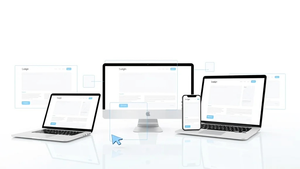
Responsive web design has quickly become essential for businesses and organizations aiming to connect with their users wherever they are. Thanks to the rise in mobile device usage, a site that looks great and loads fast only on a desktop is no longer sufficient. Users expect a seamless experience—whether on a smartphone, a tablet, or a large desktop monitor. By implementing responsive design principles, you ensure that your web pages adjust intelligently to all screen sizes, providing an optimized layout and smooth navigation across devices.
The real power of responsive web design lies in its ability to enhance user experience and boost your presence in search engine results. Google itself prioritizes mobile-friendly websites in its rankings, meaning responsive sites enjoy increased visibility and higher conversion rates. This makes the investment in responsive web design not just about aesthetics but also about your website’s overall effectiveness and business success. Ignoring this crucial aspect of web development could cost you valuable customers and limit your online growth potential.
Over 60% of website traffic now comes from mobile devices—businesses without responsive web design risk losing more than half their potential audience.

What You’ll Learn About Responsive Web Design
- The fundamentals of responsive web design and its impact
- How responsive websites improve user experience and SEO
- Key principles and technologies behind responsive web design
- Expert insights on design and develop best practices
- Answers to the top People Also Ask questions on responsive web design
The Evolution of Web Design: From Fixed to Responsive Web
Web design has undergone a dramatic transformation since the earliest days of the internet. In the past, web pages were built to fit a fixed screen width—usually optimized for desktop monitors with little consideration for mobile devices or varying screen resolutions. This fixed layout approach made websites look awkward and often unusable on smaller screens, especially as smartphones and tablets became more popular. The introduction of responsive web design marked a paradigm shift, enabling web pages to adapt automatically to the size and capabilities of any device used to access them.
Today, responsive design is no longer a futuristic concept but a core requirement for web development. By using flexible grids, fluid layouts, and technologies like media queries, modern websites deliver a consistent, engaging user experience on every screen size. As digital interactions have moved from desktops to mobile phones and tablets, responsiveness ensures that users never have to zoom, scroll horizontally, or struggle with tiny links. This seamless experience keeps users engaged and coming back, no matter how they choose to browse.
As you explore the evolution and best practices of responsive web design, it's also valuable to stay updated on the latest trends and actionable strategies shaping the digital landscape. For timely insights and practical tips that can help your business adapt to ongoing changes, check out the latest features on Small Business Today.
"Responsive web design isn’t just a trend; it’s the present and future of how we connect with users online."

Defining Responsive Web Design: Key Concepts and Terminology
What Is Responsive Web Design?
- Definition and Importance: Responsive web design is a modern web development approach where a website’s layout and content automatically adapt to fit different screen sizes and resolutions. This concept, first introduced by Ethan Marcotte in 2010, ensures visitors enjoy a consistent experience whether they’re on a desktop computer, a tablet, or a mobile phone.
- Difference from Adaptive Web Design: While both responsive and adaptive designs aim to provide better experiences across devices, responsive design uses flexible grids and layouts that fluidly resize, whereas adaptive design switches between predefined layouts for specific devices.
- Role in Modern Web Development: Responsive web design is integral to creating accessible, mobile-friendly websites that load efficiently and look attractive on any device, reducing user frustration and increasing engagement.
This approach benefits developers and users alike by simplifying maintenance—there’s only one web page to manage, rather than creating separate sites for desktops and mobile devices. As user experience has become a ranking factor for search engines, having a responsive website supports your overall digital strategy and ensures you remain competitive in an increasingly mobile world.
Key Features of Responsive Web Design
- Fluid Grids: At the heart of responsive web design is the flexible grid layout. Rather than setting absolute pixel values, elements are sized using relative units like percentages, so content scales proportionally with the browser window or device screen width.
- Flexible Images and Media Queries: Media queries are CSS techniques that allow your site to detect the device’s characteristics (such as screen width or pixel density) and apply specific styles accordingly. Flexible images automatically adjust their size to fit the screen, ensuring visuals remain sharp and appropriately scaled across devices.
- Breakpoints and Layout Changes: Breakpoints are defined in your CSS to adjust layout and content display at certain screen widths, creating a responsive behavior where navigation, font size, and columns can shift for optimal usability.
Together, these features ensure that your responsive website maintains readability, functionality, and visual appeal regardless of how users access it. This adaptability is what sets responsive web design apart as a standard in modern web development.
Core Benefits of Responsive Web Design for User Experience and SEO
Enhanced User Experience Across All Devices
With mobile devices now the primary gateway to the web, delivering an accessible and intuitive user experience is critical. Responsive web design takes the guesswork out of presenting your site to users by automatically resizing and reformatting your web pages based on the screen size, orientation, or browser window. As a result, users encounter smooth navigation, readable text, and appropriately sized images—without endless pinching or scrolling. This consistent user interface boosts engagement, encourages longer visits, and reduces bounce rates. It’s no wonder that brands investing in responsive design consistently report higher user satisfaction and stronger digital loyalty.
Moreover, responsive sites cater not only to users but also to different usage contexts. Whether your audience is checking your responsive website from a small phone on the go, a tablet at home, or a large monitor at work, the experience feels seamless. This adaptability is vital for building trust and ensuring that your message or product is communicated effectively across the board, making user experience a cornerstone of successful web design strategies.
SEO Advantages of Responsive Web Design
- Improved Search Engine Rankings: Search engines like Google reward mobile-friendly, responsive websites with better rankings, especially since mobile-first indexing became standard. If your site works flawlessly across all devices, it’s more likely to appear higher on results pages.
- Faster Page Load Times: Responsive design techniques help reduce unnecessary resource loads by serving optimized images and layouts, resulting in quicker load times—an essential ranking factor and key to keeping users on your site.
- Single URL Structure for Better Indexing: Having a single URL for each web page simplifies search engine indexing and lowers the risk of duplicate content penalties, improving your site’s authority and visibility.
Incorporating responsive web design into your site benefits not just users but your bottom line as well. A responsive site is easier to manage, ranks higher in search results, and brings more organic traffic, making it a win-win solution for long-term online growth.
"Google prioritizes mobile-friendly websites, making responsive web design vital for visibility."

How Responsive Web Design Works: Technology and Techniques
Fluid Grids and the Use of Width Property
One of the foundational principles in responsive web design is the fluid grid system. Unlike traditional layouts that use rigid pixel values, fluid grids employ percentages or other relative units so that page elements expand or contract in harmony with the browser window. By adjusting the width property of containers and elements, you ensure your layout remains consistent across different screen sizes and orientations. This approach allows for smooth transitions and prevents content from breaking or overlapping on smaller screens, creating a more predictable browsing experience.
Using fluid grids streamlines the process of designing and developing websites for a diverse audience. It reduces the need for device-specific templates by letting the content reflow naturally. Modern web developers often combine fluid grids with scalable typography to further enhance accessibility and readability, making sure the experience is enjoyable regardless of device or zoom level.
Media Queries: The Backbone of Responsive Design
Media queries are a CSS feature that enables web designers to apply unique styles depending on characteristics such as device width, height, orientation, and resolution. This technology forms the backbone of responsive web design, allowing you to set breakpoints—screen width thresholds at which the site’s layout, font size, or navigation changes to better suit the device. For instance, your navigation menu might display horizontally on desktops but collapse into a dropdown on smartphones, all thanks to media queries.
Media queries give you precise control over the appearance and behavior of your responsive website. They support a wide variety of devices, ensure accessibility, and help you create responsive designs that are functional and attractive at every screen resolution. The flexibility offered by media queries makes it possible to meet user needs and expectations, strengthening both usability and SEO.
Flexible Images and Responsive Images Strategies
Images often present a challenge when creating responsive websites due to variation in screen sizes and resolutions. The best practice is to use flexible images—those with a max-width: 100%; CSS rule—so they automatically scale to fit their bounding containers. For more advanced control, the srcset and sizes attributes in HTML allow serving different image files based on the device’s screen size or resolution, ensuring high-quality visuals without sacrificing performance.
Adopting responsive images strategies means your visuals won’t slow down your site on smaller devices, and details remain crisp and clear on high-density screens. This leads to improved load times and a polished user interface, benefiting both user experience and SEO.
| Technology | Description | Role in Responsive Web Design |
|---|---|---|
| Fluid Grids | Layouts based on relative units (%, em) | Ensures layout adapts fluidly to any screen width |
| Media Queries | CSS rules triggered by device characteristics | Applies specific styles at different breakpoints |
| Responsive Images | Images that adjust size based on container and device | Improves loading times & maintains visual quality on all devices |

Designing and Developing a Responsive Website: Step-by-Step Guide
Planning for Responsive Web Design
- Setting goals based on user experience needs: Start with a clear understanding of who your users are and what they expect from your site. Define measurable goals, such as improved mobile engagement, accessibility compliance, or decreased bounce rates.
- Identifying target devices and breakpoints: Analyze traffic analytics to identify the most common devices and determine appropriate CSS breakpoints (such as 320px, 768px, and 1200px).
- Competitive analysis for web design approaches: Review competitor websites to identify strengths and gaps in their responsive strategies. This will help you craft a unique user experience and stand out in your market.
Thorough planning is essential for successful responsive web projects. A well-structured plan will save time and resources, minimize rework, and ensure your responsive site meets user expectations right from launch.
Creating Responsive Layouts: Best Practices
- Mobile-first vs. desktop-first approaches: A mobile-first strategy prioritizes small screens and adds features for larger devices through progressive enhancement, making it a preferred method for modern web development. Desktop-first starts with larger layouts and adapts features for smaller screens, which may result in unnecessary complexity.
- Implementing flexible containers and typography: Use scalable units (%, em, rem) for fonts and containers. This provides flexibility and ensures consistency as the web page stretches or shrinks to fit different device sizes.
- Testing across device simulators and real devices: Always validate your responsive website by testing it on a variety of devices and browsers. Device simulators help for quick checks, but nothing beats using actual devices to spot real-world issues and fine-tune user experience.
Consistent, accessible design is the hallmark of responsive web design best practices. Test early and often to ensure a polished, professional result.
Tutorial: Building a Basic Responsive Web Page From Scratch
Handling Navigation in Responsive Web Design
Navigation menus present one of the trickiest challenges in responsive web design. Desktop layouts often use horizontal menus, which simply don’t fit on mobile phones or smaller screens. The common solution is to convert navigation menus into hamburger-style icons or collapsible panels on small devices, preserving accessibility and usability. Using clear icons, logical grouping, and touch-friendly targets makes navigation intuitive for every user and device.
When you design and develop navigation, prioritize user experience by testing ease of use with both mouse and touch input, and make sure it’s quickly accessible at any viewport width. Effective responsive navigation ensures that users never struggle to find what they’re looking for, dramatically improving satisfaction and conversion rates for your responsive website.

Responsive Web Design Challenges and How to Overcome Them
Common Pitfalls in Responsive Web Design
- Slow load times due to unoptimized images: High-resolution images that aren’t optimized for mobile slow down load time, frustrating users and damaging SEO rankings. Always use responsive images and compression techniques.
- Unintuitive touch targets: Small buttons and links are difficult to use on mobile devices. Increase touch target sizes and spacing for effortless navigation.
- Cross-browser compatibility issues: Not all browsers interpret CSS3 media queries and modern properties identically. Always check site rendering and behavior on popular browsers and platform versions.
Proactive planning and rigorous testing help overcome these obstacles, ensuring smooth performance and accessibility for your responsive website.
Testing and Debugging Responsive Websites
Testing is a non-negotiable step in the responsive design process. Employ browser-based tools like Chrome DevTools or Firefox’s Responsive Design Mode, which allow you to preview how your website appears across various devices and screen sizes. Real device testing, complemented by emulators, exposes quirks unique to certain hardware or browsers. Automate regression testing where possible to spot layout breaks early.
Debugging common issues—such as layout overflows, image distortion, or unresponsive navigation—requires a mix of careful inspection and targeted CSS adjustments. Always document and resolve issues methodically to build a robust, reliable responsive website.
Real-World Responsive Web Design Debugging: Common Mistakes and Fixes

Industry Case Studies: Responsive Web Design in Action
| Brand | Metric (Before) | Metric (After) | Improvement |
|---|---|---|---|
| Global Retail Brand | Mobile traffic: 27% | Mobile traffic: 47% | +73% increase |
| Media Company | Bounce rate: 61% | Bounce rate: 38% | Better engagement |
| Healthcare Site | SEO ranking: Page 3 | SEO ranking: Page 1 | Improved visibility |
"After transitioning to a responsive website, our mobile traffic increased by 73%." — Marketing Director, Retail Brand

Responsive Web Design and User Experience: The Interconnected Journey
The Impact of Responsive Web Design on User Retention
A seamless, device-agnostic browsing experience is critical for keeping visitors engaged. Responsive web design fosters higher user retention by eliminating the pain points associated with awkward layouts, slow load times, and difficult navigation on mobile devices. When users can transition effortlessly between devices while accessing a site, they’re more likely to return and interact with your brand in the future. Increased retention translates directly to more leads, sales, and a stronger digital footprint for your organization.
User retention is not just about function but also perception. A responsive site signals professionalism, attention to detail, and customer-centric design, all of which enhance trust and satisfaction among your visitors.
Why User Experience (UX) Relies on Responsive Web Design
- Consistency across devices: Users enjoy a familiar look and feel as they switch from phone to tablet to laptop, reducing confusion and building loyalty.
- Accessibility improvements: A well-executed responsive site accommodates screen readers, customized font sizes, and high-contrast elements, promoting inclusivity.
- Reduced user frustration: Eliminating tiny tap targets, horizontal scrolling, and slow load times ensures users have a smooth, frustration-free experience on every screen.
Ultimately, responsive web design is the backbone of successful digital experiences. Sites that adapt to users' needs—rather than forcing users to adapt—stand out as leaders in their industries.

Cost, ROI, and Value: Investing in Responsive Web Design
Responsive Web Design vs. Traditional Web Design: Cost Analysis
| Project Type | Initial Development Cost | Maintenance Cost | Time to Launch | Long-Term Value |
|---|---|---|---|---|
| Traditional (Separate Desktop & Mobile Sites) | High (twice the work) | High (updates in two places) | Longer | Lower (redundant) |
| Responsive Web Design | Moderate (smart planning needed) | Low (single codebase) | Faster | Higher (adaptable, scalable) |
Long-Term ROI Benefits of Responsive Websites
- Lower ongoing maintenance costs: With a single, unified codebase, updates are faster and less costly than managing multiple device-specific sites.
- Improved scalability: Responsive design adapts gracefully as new device sizes and screen resolutions enter the market, extending your investment’s life.
- Increased conversion rates: By providing an excellent user experience regardless of device, you lower barriers for users to complete purchases or engagement actions.
In the long run, responsive web design minimizes waste, maximizes reach, and ensures a future-proof digital presence that’s poised for growth.

Trends and the Future of Responsive Web Design
Emerging Trends in Responsive Web Design
- Progressive web apps (PWAs): These combine the best of web and mobile app experiences, providing offline access, push notifications, and smooth interactions through responsive layouts.
- Responsive typography and animation: Modern CSS allows font sizes, line heights, and animations to adapt to screen sizes for better UX and accessibility.
- Integrating AI tools in web design: Artificial intelligence can automate aspects of responsive layout adjustments and personalize experiences based on real-time data.
These innovations promise even more powerful and adaptive web pages, supporting a broader range of user needs and devices in the next generation of web design.
Expert Predictions: The Next Evolution of Responsive Web
"The future of web design is fundamentally device-agnostic—responsive architecture is key." — Expert Web Designer

Practical Checklist: How to Create Responsive Designs Effectively
- Audit current website for responsiveness
- Set clear objectives for responsive web design improvements
- Implement media queries and flexible layouts
- Optimize responsive images and resources
- Continuously test across a range of devices
Frequently Asked Questions About Responsive Web Design
What is an example of responsive web design?
A classic example of responsive web design is the Boston Globe’s website. It automatically adjusts its layout, images, and text sizes according to the device’s screen size, providing a seamless, user-friendly experience on desktops, tablets, and mobile phones. Major brands like Amazon, Airbnb, and Apple also utilize responsive web techniques to ensure their web pages look great and function smoothly everywhere.
Is responsiveness UI or UX?
Responsiveness affects both UI (User Interface) and UX (User Experience). While the technical implementation belongs chiefly to the UI—using layouts, media queries, and component sizing—the broader impact is on UX, as it determines how users experience and interact with your site across various devices, reducing frustration and improving satisfaction.
What are the key principles of responsive web design?
The key principles are: fluid grids (using flexible, percentage-based layouts), media queries (applying specific styles for various screen widths), and flexible images (images that resize according to their container). Additionally, a mobile-first approach, accessible typography, and thorough testing are often considered part of best practice responsive design approaches.
How much do responsive web designers make?
Salaries for responsive web designers vary by region, experience, and skillset. In the United States, the average annual salary ranges from $60,000 to $100,000+, with senior or specialized designers commanding even higher pay, especially if they have expertise in user experience, web development, and advanced responsive design.
Key Takeaways: Responsive Web Design
- Responsive web design is essential for modern web development and user engagement
- It significantly improves SEO, user experience, and business outcomes
- Implementing responsive practices offers long-lasting ROI and adaptability
Ready to Future-Proof Your Online Presence with Responsive Web Design?
The time to embrace responsive web design is now. Don’t let your online presence fall behind—invest in a strategy that elevates your brand, improves user experience, and prepares your site for future growth.
If you’re inspired to take your digital strategy to the next level, consider exploring how broader business trends and technology shifts are influencing the way companies connect with their audiences. The curated stories and expert perspectives on Small Business Today offer a wealth of knowledge on adapting to change, leveraging innovation, and staying ahead in a competitive market. By expanding your understanding beyond web design, you’ll be better equipped to future-proof your business and unlock new opportunities for growth. Dive deeper into the latest business headlines and discover actionable insights that can shape your next big move.


Write A Comment